
Why are mobile e-commerce conversions so low for my store?
For over two decades navigating the dynamic currents of e-commerce, I've witnessed incredible growth alongside common pitfalls. One challenge that consistently surfaces, baffling even seasoned store owners, is the stubbornly low mobile conversion rate. It's a question I hear time and again, echoing the frustration of untapped potential.
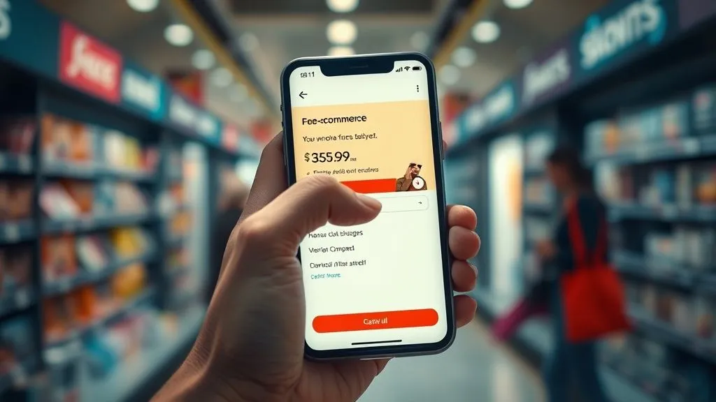
You’ve invested in a sleek website, perhaps even a dedicated app, yet your mobile traffic isn't translating into sales. It's frustrating, isn't it? That feeling of potential left untapped, knowing a significant portion of your audience is slipping through your fingers on their smartphones. This isn't just a minor annoyance; it's a significant drain on your revenue and marketing efforts.
In this deep dive, I'll pull back the curtain on the core issues behind low mobile e-commerce conversions. We'll explore actionable frameworks, dissect real-world scenarios, and equip you with expert insights to transform your mobile storefront into a high-performing revenue generator. This isn't just about minor tweaks; it's about a strategic overhaul grounded in user behavior and technical excellence.
The Mobile-First Imperative: Beyond Responsive Design
When I started in e-commerce, desktops were king. Today, that narrative has completely flipped. Mobile isn't just 'another channel'; for many businesses, it's the primary interface where customers first encounter and interact with their brand. Yet, too many stores still treat mobile as an afterthought, a 'shrunken desktop' experience, rather than a unique environment with its own user behaviors and expectations.
The fundamental mistake I often observe is equating "responsive design" with "mobile-first optimization." While responsiveness ensures your site adapts to different screen sizes, it doesn't inherently guarantee an optimized mobile experience. Users on smartphones are often on the go, easily distracted, and have less patience for friction. Their intent might be discovery, comparison, or quick purchase, requiring a distinct approach to layout, navigation, and content presentation.
"Mobile users aren't just smaller versions of desktop users; they are different users, with different needs, different contexts, and different behaviors. Design for them, not for their screen size." – Industry Insight
Understanding this distinction is the first critical step to unlocking higher mobile conversions. It’s about anticipating how a user will interact with your store specifically on a mobile device, from their thumb placement to their data connection speed. This requires a shift in mindset from merely adapting to actively designing for mobile interaction patterns and optimizing the entire user journey.

User Experience (UX) Bottlenecks: A Detailed Diagnosis
The vast majority of low mobile e-commerce conversions can be traced back to a frustrating user experience. Mobile users demand speed, clarity, and ease. Any deviation from these expectations acts as a conversion blocker. Let's break down the most common UX bottlenecks.
Slow Loading Times: The Silent Conversion Killer
In my experience, nothing kills a mobile conversion faster than a slow-loading page. A study by Google found that as page load time goes from 1 second to 3 seconds, the probability of bounce increases by 32%. Mobile users are notoriously impatient, and every millisecond counts. This isn't just anecdotal; it's backed by mountains of data from every major analytics platform.
Often, stores are weighed down by unoptimized images, excessive JavaScript, render-blocking CSS, and inefficient server responses. These technical debts accumulate, creating a sluggish experience that drives potential customers away before they even see your products. Addressing this requires a systematic approach.
Actionable Steps to Boost Mobile Page Speed:
- Optimize Images: Compress images without sacrificing quality. Use modern formats like WebP. Implement lazy loading for images below the fold.
- Minify CSS and JavaScript: Remove unnecessary characters, comments, and whitespace from your code files.
- Leverage Browser Caching: Configure your server to cache static resources, so returning visitors load pages faster.
- Reduce Server Response Time: Invest in a reliable hosting provider. Optimize your database and server-side scripts.
- Utilize a Content Delivery Network (CDN): Serve content from servers geographically closer to your users, reducing latency.
- Prioritize Above-the-Fold Content: Ensure critical content renders quickly by deferring non-essential scripts.
For a deeper dive into measuring and improving your site's performance, I highly recommend exploring Google's Core Web Vitals. These metrics are crucial indicators of real-world user experience and directly impact search rankings.
Cluttered Interfaces & Poor Navigation
Mobile screens are small, making screen real estate incredibly precious. A cluttered interface, packed with too much information, tiny text, or overlapping elements, instantly overwhelms users. Similarly, complex or hidden navigation menus make it difficult for users to find what they're looking for, leading to frustration and abandonment.
Think about how people use their phones: often with one hand, thumb reaching across the screen. Your design should facilitate this natural interaction. Clear, concise layouts, ample whitespace, and intuitive navigation are paramount. Avoid forcing users to pinch and zoom; everything should be easily readable and tappable.

Common Navigation Pitfalls to Avoid:
- Hidden Hamburger Menus: While common, ensure the icon is clear and that essential categories are easily accessible.
- Too Many Menu Items: Consolidate and prioritize. Use sub-menus judiciously.
- Small Tappable Areas: Buttons and links must be large enough for a finger tap, not a mouse click.
- Lack of Search Functionality: A prominent, effective search bar is vital for mobile users who know what they want.
Inefficient Checkout Processes
This is where many mobile e-commerce conversions truly die. The checkout process is the final hurdle, and any friction here can lead to a high abandoned cart rate. I've seen countless businesses lose sales because their checkout flow was designed for desktop, then simply crammed onto a mobile screen.
Mobile users want speed and simplicity. Long forms, mandatory account creation, confusing error messages, and a lack of trusted payment options are all critical conversion killers. Each additional field or step increases the chance of abandonment. The goal should be to make the path from 'Add to Cart' to 'Purchase Complete' as smooth and short as humanly possible.
Optimizing Your Mobile Checkout:
- Guest Checkout Option: Always offer it. Mandatory account creation is a significant barrier for first-time buyers.
- Progress Indicators: Show users how many steps are left in the checkout process.
- Auto-fill and Saved Information: Leverage browser autofill and allow returning customers to save their details.
- Mobile-Optimized Keyboards: Ensure input fields trigger the correct keyboard (e.g., numeric for phone numbers, email for email addresses).
- Clear Error Messages: If an error occurs, clearly explain what went wrong and how to fix it, without losing the user's input.
- Multiple Payment Options: Include popular mobile payment methods like Apple Pay, Google Pay, and PayPal for quick, secure transactions.
Consider the stark difference between a typical mobile checkout and an optimized one:
| Stage | Typical Mobile | Optimized Mobile |
|---|---|---|
| Account Creation | Mandatory | Optional (Guest Checkout) |
| Shipping Info | Manual Entry | Auto-fill/Saved Address Book |
| Payment Info | Long Forms | Digital Wallets/Shorter Forms |
| Review Order | Detailed Page | Concise Summary with Edit Options |
Untapped Potential: Personalization & Engagement
Beyond fixing friction, boosting mobile e-commerce conversions also involves actively engaging your users and making their experience feel unique. The mobile device is inherently personal, and your store should reflect that.
Lack of Personalized Experiences
Generic experiences are forgettable. Mobile users expect a degree of personalization, whether it's product recommendations based on their browsing history, location-specific offers, or reminders about items left in their cart. When a mobile store feels like it understands the user, it fosters a stronger connection and encourages conversion.
This isn't just about showing recent views; it's about anticipating needs and suggesting relevant items. Leveraging AI and machine learning can create dynamic, individualized shopping journeys that guide users towards products they are genuinely interested in. This transforms a transactional visit into a personalized shopping assistant experience.

Neglecting Push Notifications & In-App Messaging
For stores with a dedicated mobile app, or even progressive web apps (PWAs), push notifications and in-app messaging are goldmines for re-engagement and conversion. These channels allow you to communicate directly with users, reminding them of abandoned carts, announcing sales, or highlighting new arrivals.
However, the key is to use them judiciously and with value. Over-sending or irrelevant notifications will lead to users disabling them. Focus on timely, personalized, and valuable messages that enhance the user's experience rather than interrupting it. A well-crafted push notification can bring a user back to complete a purchase they might have otherwise forgotten.
Trust & Security: The Foundation of Mobile Transactions
In the digital realm, trust is currency. Mobile users are increasingly wary of scams and data breaches, and any perceived lack of security on your site can instantly halt a conversion. Building and maintaining trust is non-negotiable for high conversion rates.
Perceived Security Risks
Users need to feel confident that their personal and financial information is safe. This means clearly displaying security badges (SSL certificates, trusted payment provider logos), having a transparent privacy policy, and ensuring your site is free of broken links or suspicious redirects. A simple HTTP site, for example, is a massive red flag in today's mobile browser environment.
I've seen stores lose significant sales simply because their SSL certificate wasn't properly configured, triggering security warnings in mobile browsers. These small details have a huge impact on user confidence, especially when they are about to hand over their credit card details.
Transparent Pricing & Shipping
Surprise costs at checkout are a leading cause of mobile cart abandonment. Hidden shipping fees, unexpected taxes, or additional charges that weren't clearly communicated upfront create a sense of distrust. Mobile users expect full transparency, and they expect it early in the shopping journey.
Always display the total cost, including shipping and taxes, as early as possible. Offer clear shipping options and estimated delivery times. This transparency builds credibility and prevents sticker shock at the crucial conversion point, ensuring that the customer's decision to buy is based on accurate information.
The Power of Data: Analytics & A/B Testing
You can't fix what you don't measure. A robust understanding of your mobile analytics, combined with continuous A/B testing, is the engine that drives sustainable conversion rate optimization. This is where expertise truly shines – moving beyond assumptions to data-driven decisions.
Misinterpreting Mobile Analytics
Many businesses look at their overall site analytics and assume they understand their mobile users. This is a critical mistake. Mobile user behavior often differs significantly from desktop. Metrics like bounce rate, time on site, and conversion funnels need to be analyzed specifically for mobile segments.
Pay close attention to mobile-specific metrics: touch heatmaps, scroll depth on mobile pages, device type breakdowns, and carrier-specific performance. Identify where mobile users are dropping off in your funnel. Is it on product pages? During checkout? Each drop-off point is an opportunity for targeted improvement. Tools like Google Analytics and Hotjar provide invaluable insights into mobile user behavior. For more advanced analysis, consider platforms specializing in mobile app analytics if you have a dedicated app.
Understanding these nuances helps answer not just that your mobile conversions are low, but why, providing a clear roadmap for intervention. Forbes has a great piece on the importance of mobile-specific analytics.
Underestimating A/B Testing for Mobile
Once you've identified potential friction points through analytics, A/B testing becomes your most powerful tool for validating solutions. Don't assume a change will work; test it. Small, iterative changes can lead to significant cumulative gains in mobile conversion rates.
Test everything: button colors, call-to-action text, navigation menu layouts, product image sizes, form field labels, and even the placement of trust badges. Ensure your A/B tests are specifically designed and analyzed for mobile users, as desktop results may not translate directly. Continuous testing fosters a culture of optimization and ensures your mobile store is always evolving to meet user needs.
Here are some common elements to A/B test on your mobile site:
| Element | A/B Test Idea |
|---|---|
| Call-to-Action Buttons | Color, text, size, and placement on product pages |
| Navigation Menu | Hamburger vs. Tab bar, icon vs. text labels, menu item order |
| Product Page Layout | Image gallery position, 'Add to Cart' visibility, review section placement |
| Checkout Flow | Number of steps, guest checkout prominence, payment method order |
| Search Bar | Prominence, icon vs. text field, search suggestions |
Case Study: Reimagining Mobile for "TrendSetters Apparel"
Let me share a fictional, yet highly realistic, scenario that illustrates the power of these principles. "TrendSetters Apparel," a mid-sized online fashion retailer, approached me with a classic problem: their mobile traffic was booming, but mobile conversions lagged significantly behind desktop, contributing to the question, "Why are mobile e-commerce conversions so low for my store?"
Their initial mobile site was responsive but suffered from several critical issues. Page load times were consistently above 5 seconds, the checkout required mandatory account creation and had an eight-step process, and product pages were crammed with tiny text and unoptimized images. Furthermore, they offered no personalized recommendations, making the browsing experience feel generic.
The Transformation Journey:
- Speed Optimization: We started by aggressively compressing all images, minifying CSS/JS, and implementing a CDN. Mobile load times dropped to an average of 1.8 seconds.
- Checkout Streamlining: We introduced a prominent guest checkout option, reduced the checkout to three intuitive steps (shipping, payment, review), and integrated Apple Pay and Google Pay.
- UX Overhaul: Product pages were redesigned for mobile-first readability, with larger, high-quality images, concise descriptions, and clear, tappable 'Add to Cart' buttons. Navigation was simplified to a bottom tab bar for key categories and a prominent search icon.
- Personalization Engine: We integrated an AI-driven recommendation engine, showcasing "You Might Also Like" and "Complete the Look" sections based on user behavior and purchase history.
The Results: Within six months, TrendSetters Apparel saw a remarkable 70% increase in mobile conversion rates. Their abandoned cart rate on mobile dropped by 45%, and average order value for mobile purchases increased by 15% due to improved product discovery through personalization. This wasn't magic; it was a systematic application of mobile-first optimization principles, directly addressing why their mobile e-commerce conversions were so low.
Technical Glitches & Cross-Device Inconsistencies
Even with great design, underlying technical flaws can cripple mobile conversions. It's not enough for your site to merely look good; it must function flawlessly across the myriad of mobile devices and operating systems.
Broken Functionality & Responsiveness Issues
I've encountered situations where a button works perfectly on an iPhone but is completely unresponsive on an Android device, or a form field that renders correctly on one browser breaks on another. These technical glitches, often overlooked in basic testing, are absolute conversion killers. Users expect a seamless experience regardless of their device or browser choice.
Thorough, continuous testing across a wide range of devices, operating systems, and browser versions is crucial. This includes emulating different network conditions. Manual testing by real users on real devices is often more effective than relying solely on emulators. Identifying and fixing these bugs quickly prevents frustrating customer experiences that lead to high bounce rates and low conversions.
Payment Gateway Friction
The payment gateway is the final, critical step in the mobile conversion funnel. If your chosen payment provider isn't optimized for mobile, or if the integration is clunky, you're creating unnecessary friction. This often manifests as slow redirection, non-responsive payment forms, or a lack of popular mobile payment options.
Ensure your payment gateway offers a mobile-first experience. This means supporting digital wallets like Apple Pay, Google Pay, and PayPal, which allow for one-tap payments. It also means the payment page itself is fully responsive, loads quickly, and minimizes the number of fields a user has to manually enter. A smooth, secure, and fast payment process is the ultimate sign-off for a successful mobile conversion.
Content Optimization for the Small Screen
The way content is consumed on mobile is fundamentally different from desktop. What works on a large monitor can be overwhelming or invisible on a smartphone. Optimizing your content for the small screen is a subtle yet powerful lever for improving mobile e-commerce conversions.
Overwhelming Product Descriptions
On desktop, users might be willing to scroll through lengthy product descriptions. On mobile, they want information quickly and concisely. Long, unbroken paragraphs are a nightmare to read on a small screen. This leads to users scanning, missing key details, or simply abandoning the page out of frustration.
Break up your product descriptions into easily digestible chunks. Use bullet points for key features and benefits. Employ bold text to highlight crucial information. Prioritize the most important details at the top. Think about what a mobile user needs to know at a glance to make a purchasing decision, and present it clearly and efficiently. A well-structured description can significantly improve engagement and conversion rates.
Subpar Product Imagery & Video
High-quality visuals are paramount in e-commerce, and even more so on mobile. Small, low-resolution images that don't allow for zooming or multiple angles are a serious handicap. Mobile users rely heavily on visuals to assess products, especially in categories like apparel, home goods, or electronics.
Ensure your product images are high-resolution, optimized for fast loading, and support pinch-to-zoom functionality. Offer multiple angles, lifestyle shots, and even short, compelling product videos. These visual assets tell a story and provide crucial context that text alone cannot, directly impacting a mobile user's confidence to purchase. A visually rich, fast-loading product page can be the difference between a browse and a buy, helping to answer why are mobile e-commerce conversions so low for my store?
Frequently Asked Questions (FAQ)
Q: How quickly should my mobile site load to avoid high bounce rates? A: Ideally, your mobile site should load in under 2-3 seconds. Studies consistently show that bounce rates increase dramatically for every second beyond this threshold. Aim for a Google PageSpeed Insights score in the 'Good' or 'Excellent' range, paying close attention to Core Web Vitals like Largest Contentful Paint (LCP) and First Input Delay (FID).
Q: Is a dedicated mobile app always better than a highly optimized mobile website for conversions? A: Not necessarily. While apps can offer deeper personalization and engagement through push notifications, they also require users to download them, which is a significant barrier. A highly optimized, fast-loading mobile website (or a Progressive Web App - PWA) can often achieve comparable, if not better, conversion rates for many businesses, especially for initial discovery and first-time purchases. The choice depends on your business model and customer lifecycle.
Q: What's the most impactful change I can make right now to improve mobile conversions? A: Based on my experience, the single most impactful change is almost always simplifying and optimizing your mobile checkout process. Address mandatory account creation, reduce the number of steps and fields, and integrate mobile-friendly payment options. This is where the highest friction often exists, and even small improvements can yield significant conversion boosts.
Q: How often should I be A/B testing my mobile e-commerce site? A: A/B testing should be a continuous process, not a one-off project. I recommend having at least one or two A/B tests running at all times on your mobile site, focusing on high-impact areas identified through your analytics. This iterative approach ensures constant improvement and adaptation to evolving user behaviors and market trends.
Q: What are the key metrics I should focus on when analyzing mobile conversion performance? A: Beyond your overall mobile conversion rate, focus on mobile bounce rate, mobile session duration, mobile-specific cart abandonment rate, tap/click-through rates on key mobile elements, and the performance of your mobile search function. Also, segment your data by device type (iOS vs. Android) and browser to uncover specific performance issues.
Key Takeaways and Final Thoughts
The question, "Why are mobile e-commerce conversions so low for my store?" is a critical one, and its answer lies in a holistic approach to mobile-first optimization. It's not about a single magic bullet, but a commitment to excellence across user experience, technical performance, and strategic engagement. Here are the core principles to remember:
- Prioritize Speed: Every millisecond counts. Optimize images, code, and server response times.
- Streamline UX: Design for the thumb, declutter interfaces, and simplify navigation.
- Perfect the Checkout: Offer guest checkout, reduce steps, and integrate mobile payment options.
- Personalize Experiences: Use data to offer relevant recommendations and engaging content.
- Build Trust: Ensure security, transparency, and clear communication on costs.
- Leverage Data: Analyze mobile-specific metrics and run continuous A/B tests.
- Optimize Content: Make product descriptions concise and visuals compelling for small screens.
Embracing these strategies will not only elevate your mobile conversion rates but also build a more resilient, customer-centric e-commerce business. The mobile landscape is constantly evolving, and by staying agile, data-driven, and focused on the user, you can transform your mobile store from a source of frustration into a powerful engine for growth. The opportunity is immense; it's time to seize it.
Recommended Reading
- 5 Pillars: How to Rebuild Trust & Transparency in Remote Cultures?
- Google Business Profile Suspension? 7 Steps to Rapid Recovery
- 7 Proven Ways to Boost Working Capital with High Sales, Low Cash
- Uncover Why Profits Dive: 7 Data Steps to Root Cause Analysis
- 5 Steps to Eliminate Workflow Bottlenecks with Automation & Boost Efficiency


Comments
Leave a comment below. Your email will not be published. Required fields marked with *